INTRODUCTION
BNR is a Swiss association dedicated to the digitization of public domain works, primarily by lesser-known French-speaking authors. Its mission is to preserve these texts, promote reading, and give visibility to authors who are part of the literary heritage but have not always received wide recognition.
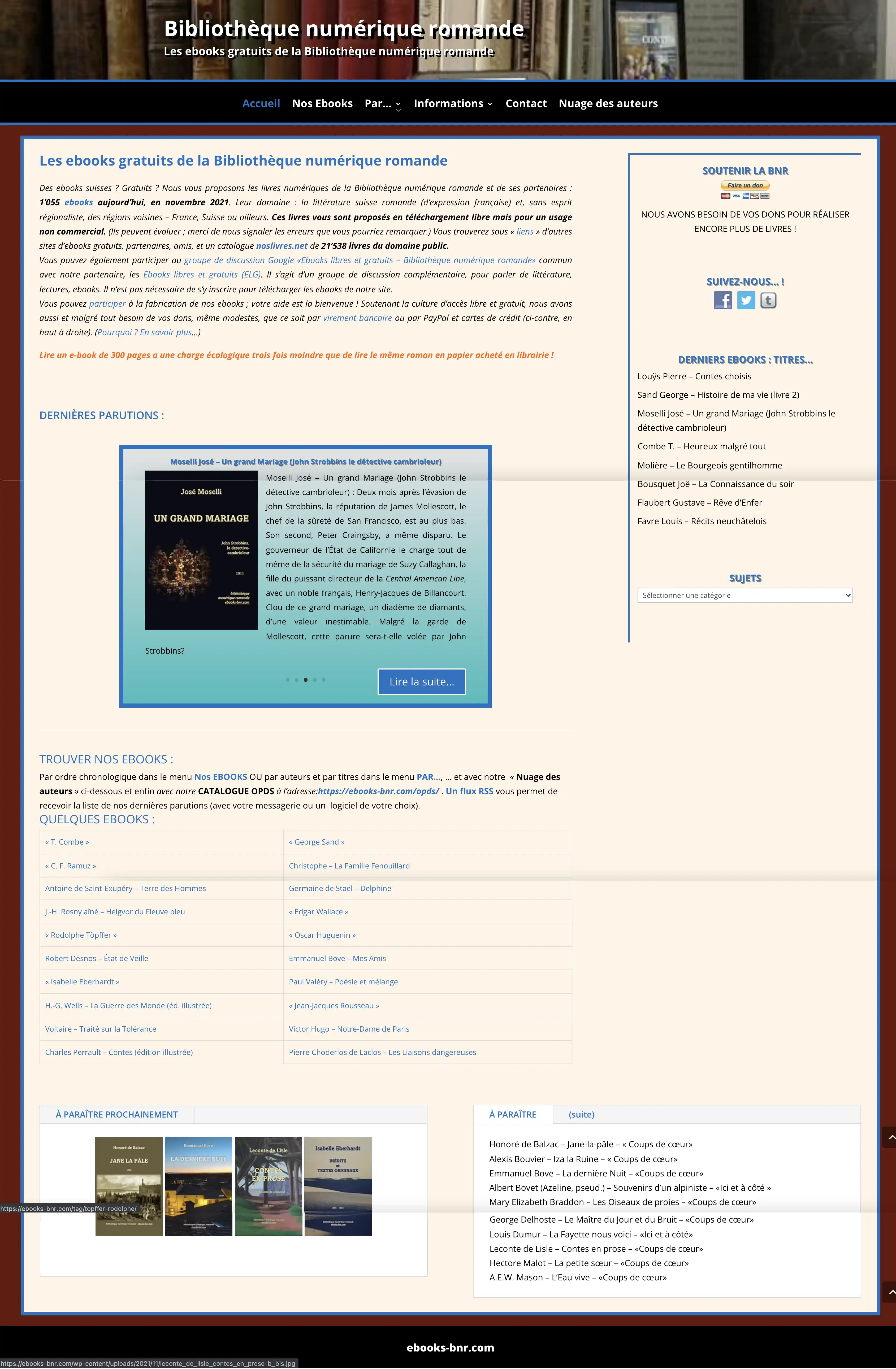
PREVIOUS DESIGN
Although the original website had a defined structure, it presented conflicts between content hierarchy and visual hierarchy, creating friction in reading flow and navigation. The interface was not responsive and maintained an outdated aesthetic, which affected overall clarity and usability.


OBJECTIVES
The project focused on redesigning the brand identity and the existing website interface, which lacked a defined visual direction and presented structural inconsistencies.
- Establish a cohesive and formal visual design.
- Prioritize clarity, readability, and ease of navigation.
- Avoid an overly modern or complex aesthetic.
- Integrate donation calls to action without being intrusive.
MY ROLE
My role centered on designing the brand identity and leading the full website redesign. The overall content structure needed to remain intact, while the content hierarchy and visual organization allowed for precise and justified adjustments to improve readability and coherence. It was essential to maintain a clean and functional design, ensuring ease of implementation in development by avoiding unnecessary animations or complex visual solutions that would complicate technical execution.
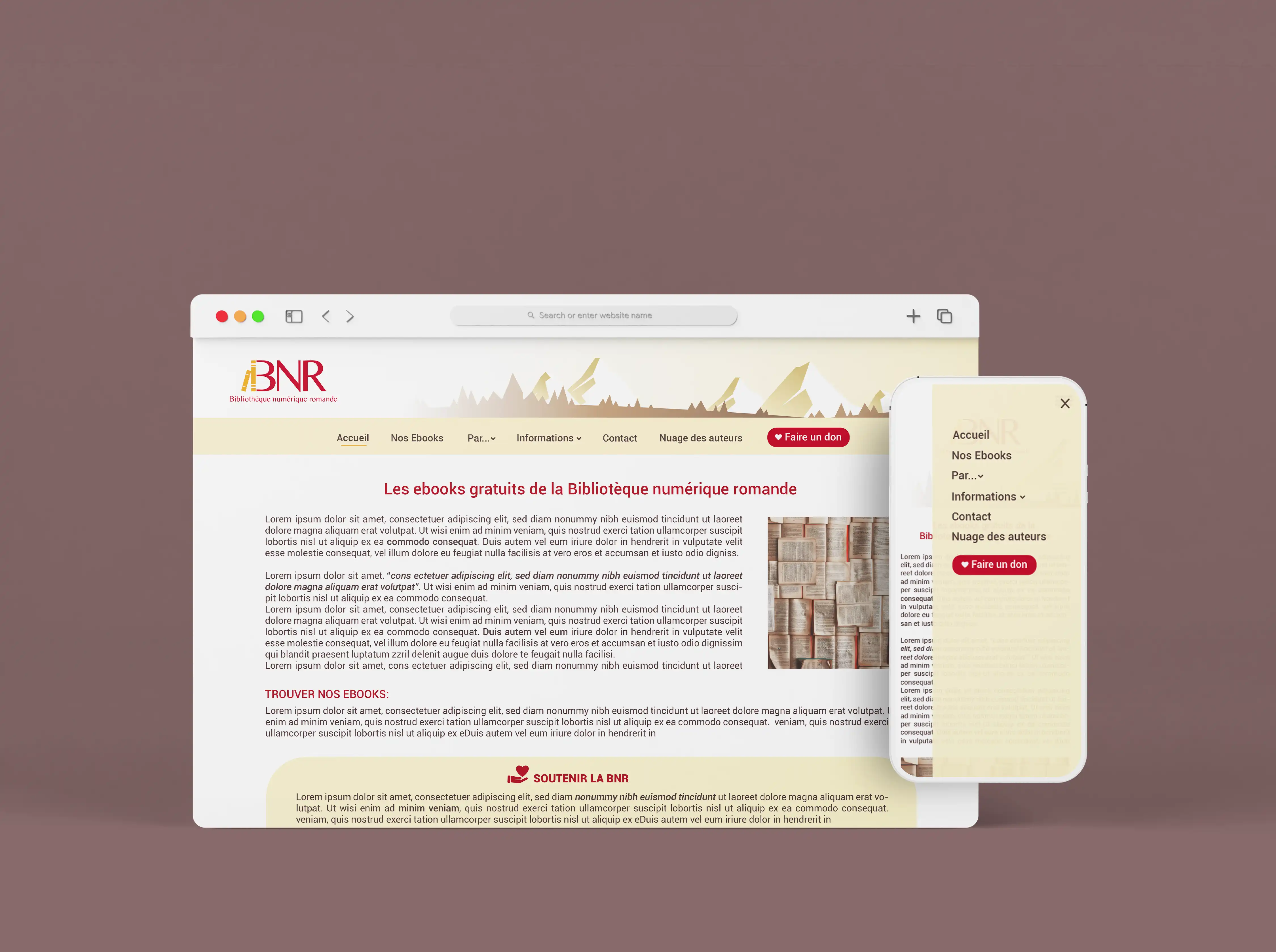
WIREFRAMING
The wireframing phase allowed for a comprehensive review of the content architecture and helped identify structural improvements before moving into visual design. This stage supported refinements aimed at enhancing reading flow and user experience, while also helping anticipate the technical scope required for the redesign.


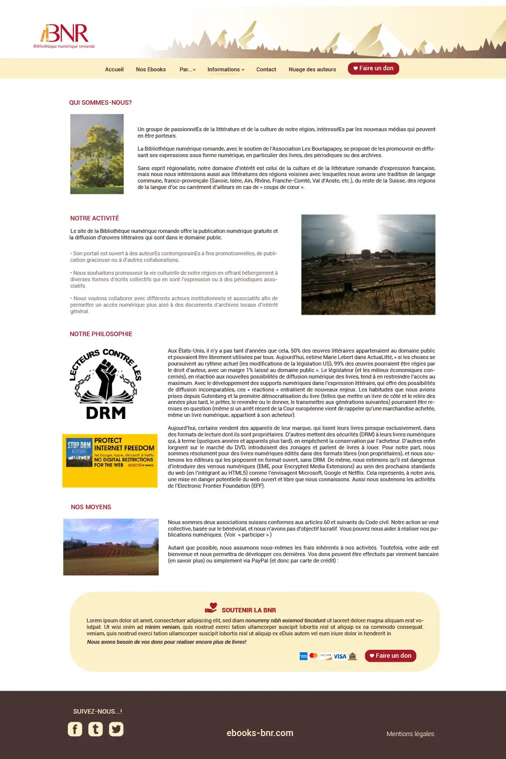
VISUAL DESIGN
In the visual phase, the defined color palette and typography were integrated into the interface. The previous design was simplified, removing elements that caused visual noise or reduced clarity. Donation calls to action were incorporated within a structured visual hierarchy, ensuring consistent presence across pages without becoming intrusive. Color was used strategically to reinforce content organization and guide user attention. The result was a clean, clear, and concise interface designed to facilitate technical implementation, improve reading experience, and preserve the formal and institutional character of the association.