BRIEF
Integralmente is a psychological specialty clinic committed to providing high-quality care for children, adolescents, and adults, both in-person and online.
Its approach is based on an integral model of care that considers physical, psychological, and—if the patient wishes—spiritual well-being. The visual identity needed to convey clarity, warmth, and serenity, subtly reflecting the relationship between body, mind, and spirit without generating religious connotations or adopting a rigid clinical aesthetic. The objective was to build a clear, approachable, and professional image capable of fostering trust and a sense of support within a field historically marked by social stigma.
SKETCHING AND VECTORIZATION
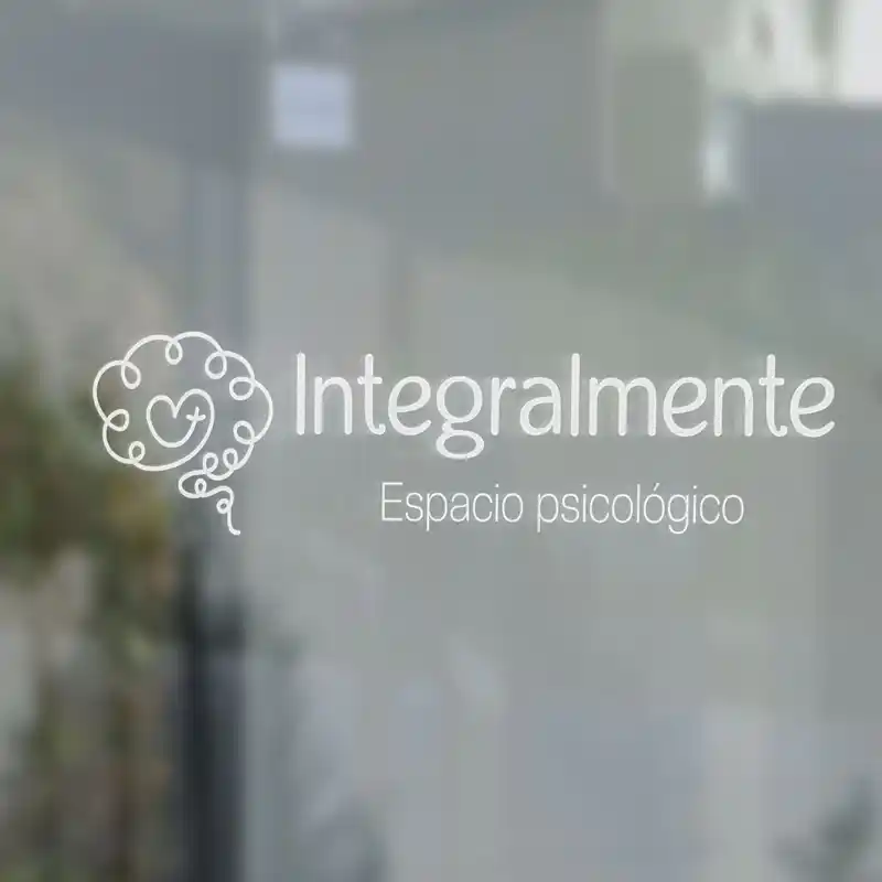
During the conceptual phase, common symbols associated with psychology—such as the brain—were analyzed. Rather than avoiding recognizable references, the goal was to reinterpret them within a coherent symbolic structure aligned with the clinic's integral approach. The final icon is constructed from a continuous line forming the brain, representing the psychological dimension. This same line transforms and connects with the shape of a heart, symbolizing the body and emotional dimension. At the center, a subtle cross-shaped form is integrated to represent the spiritual dimension, treated abstractly and in a balanced manner to avoid direct religious associations. The continuous line functions as a metaphor for the therapeutic process: a journey with highs and lows that, despite its variations, remains connected as a whole. This visual integration reinforces the clinic's concept of holistic care. Initial concepts were developed by hand, exploring balanced compositions and appropriate levels of visual synthesis. During vectorization, the symbol was evaluated for legibility, proportion, and flexibility across various sizes and applications, ensuring consistency in both digital and print environments. The use of clean, rounded lines softens traditional sector symbolism, generating a more approachable perception within a field often associated with rigidity.
LOGO VARIATIONS
COLOR PALETTE AND TYPOGRAPHY
The color palette was designed to evoke serenity, trust, and closeness. Light blue was selected as the primary color due to its association with calmness, openness, and emotional stability—qualities aligned with the therapeutic environment. Secondary colors were defined as harmonious complements, reinforcing visual hierarchy while maintaining balance within the graphic system without creating saturation. For typography, a sans-serif typeface with subtly rounded edges was chosen, formally aligned with the organic line of the icon. Variations in weight allow for visual rhythm and contrast without compromising clarity or accessibility. The result is a clean, approachable, and professional visual identity designed to communicate trust and support from a holistic perspective.